Let the product establish the identity
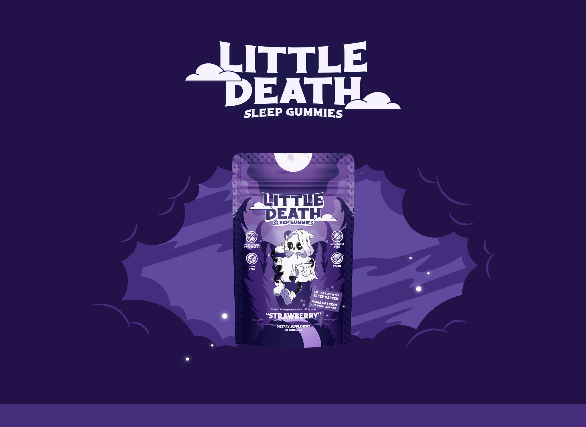
Purple packaging and prominent product imagery give the page a distinctive starting point. The surrounding interface supports that identity without making every section equally visually dense.
Shopify · Single-product landing page
Little Death centres on a sleep supplement with a strong visual identity. My UI and visual design gives the product room to stand out, then organises the supporting information into smaller, readable sections.
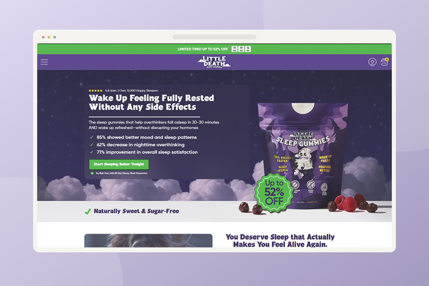
Give a single-product store a distinct personality while keeping product information and purchase options easy to find.
A deep purple palette and bold visual treatment establish the mood. The page brings the product to the forefront, then connects benefits, ingredients and trust signals through a focused narrative.
Purple packaging and prominent product imagery give the page a distinctive starting point. The surrounding interface supports that identity without making every section equally visually dense.
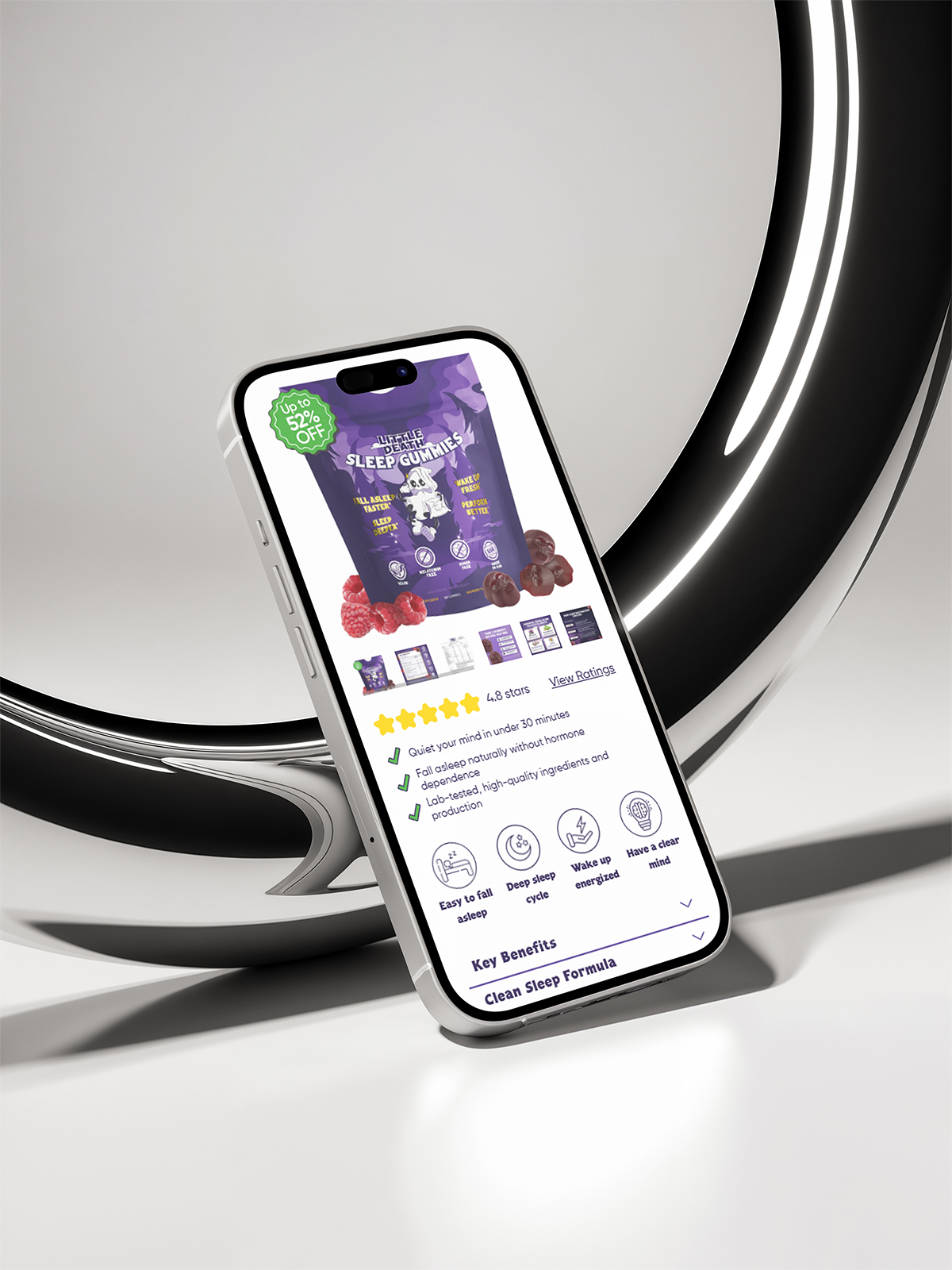
The mobile presentation places ratings, short benefit statements and icons in distinct groups. These offer a quick overview before visitors open longer product information.
Expandable sections for benefits and the formula give detailed content a defined place on the mobile page. Their usefulness depends on clear labels and accessible behaviour in implementation.
The presented work includes product-focused page designs and a mobile presentation. The emphasis is on a recognisable visual identity and a structured product-information hierarchy.
 Enlarge design ↗
 Enlarge design ↗
Test whether visitors can locate ingredients, understand purchase options and distinguish product information from promotional content on a phone.
This walkthrough explains the presented designs. Suggested validation is a next step, not a claim of testing already completed. Post-launch performance data is not included.