Separate the meal journeys
I created individual landing pages for breakfast and lunch. This gave each meal a focused destination, with the intention of making the route towards ordering easier to understand.
Web design · Food & hospitality
The client wanted two things: an easy way to order and a website that made the food look appetising. I managed both the client and developer, alongside the UI and visual design. I translated the ordering goal into individual landing pages for breakfast and lunch.
THE BREAKFAST COMPANY / FROM BRIEF TO DESIGN
I managed the client and developer while shaping the visual design. The brief combined two priorities: make ordering easier, and make the food look irresistible.
 Inspect the actual designs ↗
Help visitors find the meal they wanted to order, while giving the website the appetising look the client requested. The work needed to address both the ordering structure and the visual presentation of the food.
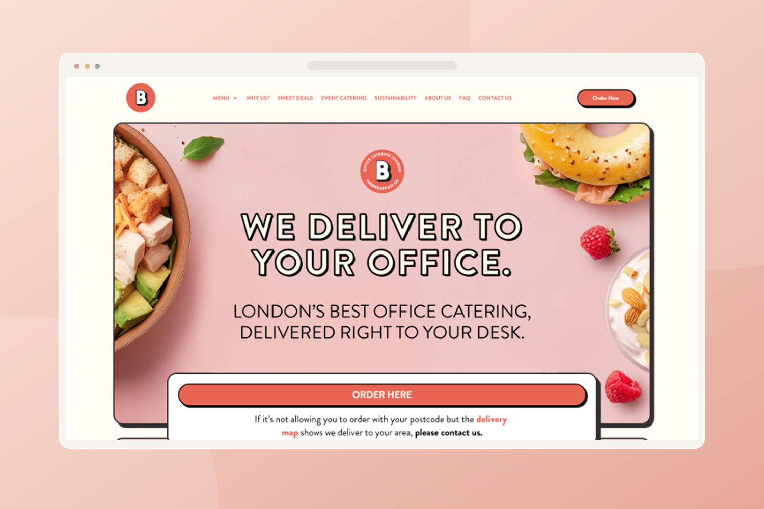
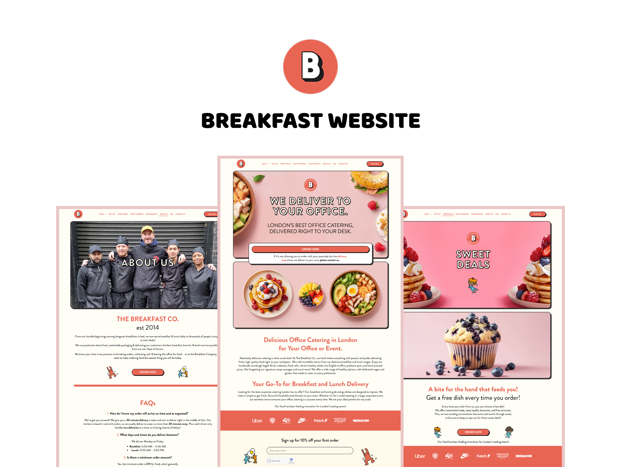
I created separate breakfast and lunch landing pages so each meal had a dedicated destination. Large food images, warm colours and a playful visual style supported the client’s request for an appetite-led design.
I created individual landing pages for breakfast and lunch. This gave each meal a focused destination, with the intention of making the route towards ordering easier to understand.
The client wanted the design to make people feel hungry. I used prominent food imagery and a warm, playful visual direction to bring the food to the foreground.
The page designs pair food imagery with visible ordering actions. The shared header and recurring visual styles connect the individual pages into one website.
I managed both the client and the developer on this project, while also creating the design. The client’s request for easier ordering became a concrete design decision: separate breakfast and lunch landing pages. Their request for an appetising look shaped the food imagery and overall visual direction. This project brought together client management, developer coordination and hands-on design around the same brief.
The work included dedicated breakfast and lunch landing pages, supported by a shared visual direction across the website. My role combined hands-on design with managing the client and developer. The output addresses the two parts of the brief: a clearer ordering structure and an appetising presentation.
Enlarge design ↗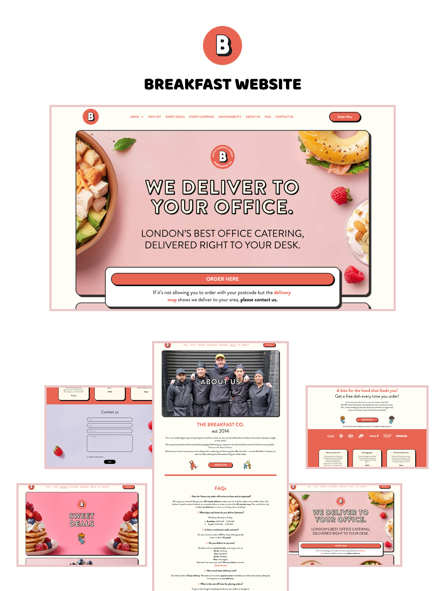 Enlarge design ↗
A useful follow-up would be to test whether visitors can choose breakfast or lunch and reach the relevant ordering action without assistance. This would check the intended benefit of the separate landing pages.
The project scope and my role are described from my experience. The suggested follow-up has not been presented as completed testing; no measured increase in orders is claimed.