An approachable opening
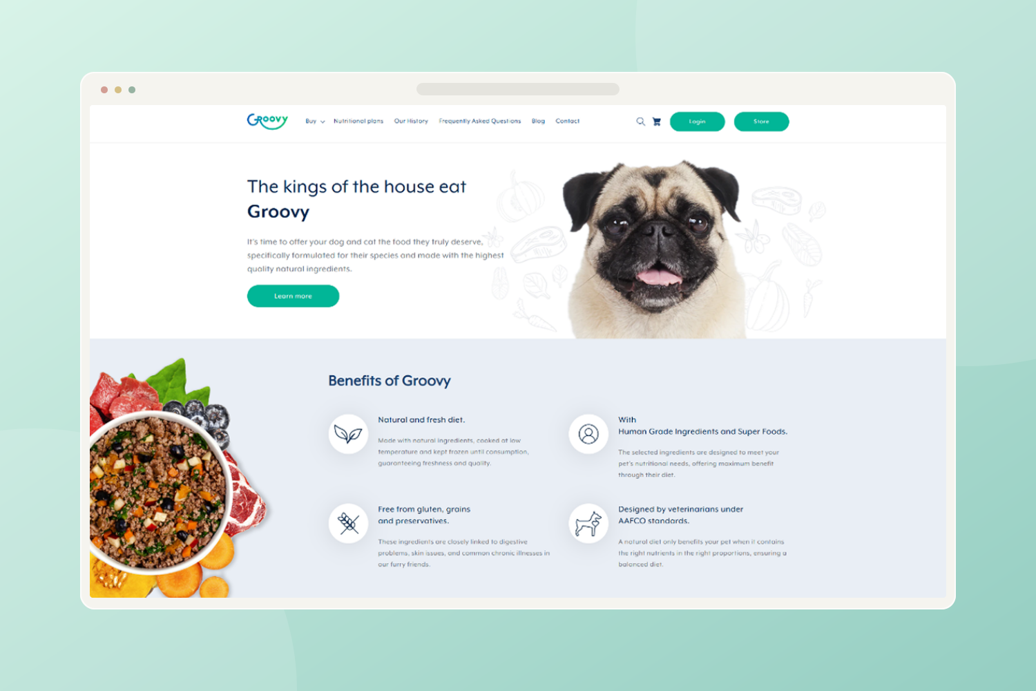
The opening pairs a pet portrait with a short nutrition proposition. The large image creates a friendly introduction, while the supporting copy gives visitors a reason to explore the food range.
Shopify · Pet nutrition
Groovy needed to explain its food range while keeping the experience approachable. My UI and visual design brings the pet, the nutrition story and the products into a single browsing experience.
Explain a nutrition-led proposition without making the shopping experience feel clinical or complicated.
Fresh turquoise accents, generous whitespace and pet imagery give the brand an approachable voice. Clear product groupings and ingredient-led content put the essentials within reach.
The opening pairs a pet portrait with a short nutrition proposition. The large image creates a friendly introduction, while the supporting copy gives visitors a reason to explore the food range.
A separate benefits section uses icons and short explanations to break down the proposition. This gives the nutrition story a clear place without overloading the product cards.
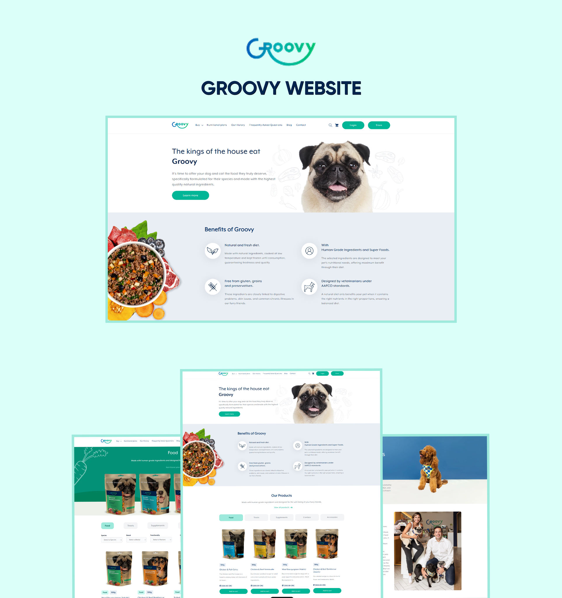
Category tabs and repeated product cards give the range a consistent browsing structure. Turquoise actions carry through the page so shopping links remain visually connected.
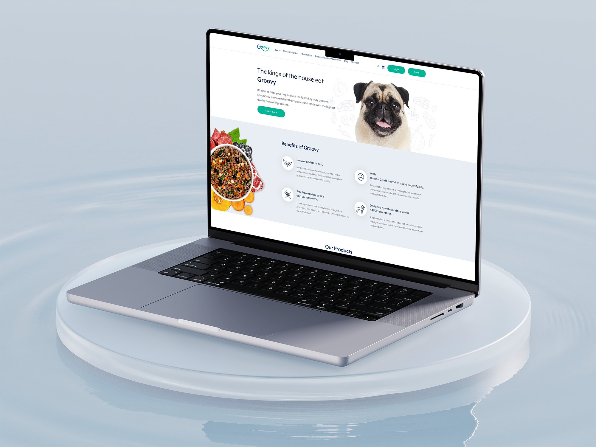
The presented work includes a homepage, product browsing layouts and supporting brand content. It demonstrates how the nutrition story and the catalogue can share a consistent visual language.
 Enlarge design ↗
 Enlarge design ↗
Test whether a first-time visitor can find an appropriate food category and explain the product differences without help.
This walkthrough explains the presented designs. Suggested validation is a next step, not a claim of testing already completed. Post-launch performance data is not included.