Connect the product and the brand mood
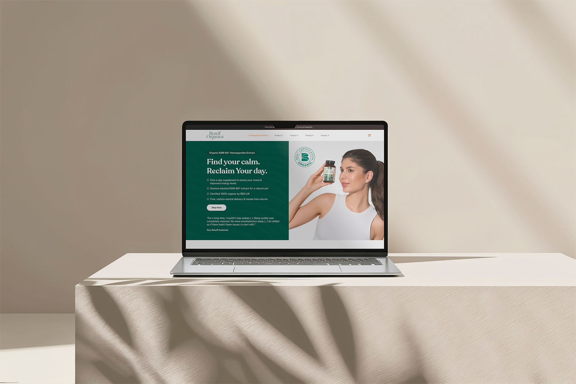
Deep green panels, warm neutrals and product photography establish a calm visual direction. The opening brings the product, short supporting points and shopping action together.
Shopify · Organic wellness
Reself Organics combines an organic wellness identity with a product-led storefront. My UI and visual design brings together the introduction, product explanation, pack options and supporting information.
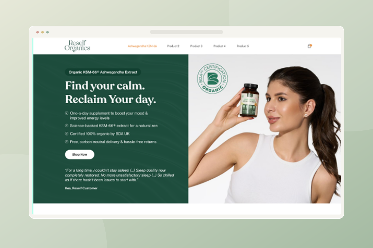
Balance the warmth of a natural wellness brand with the information customers need to evaluate the product.
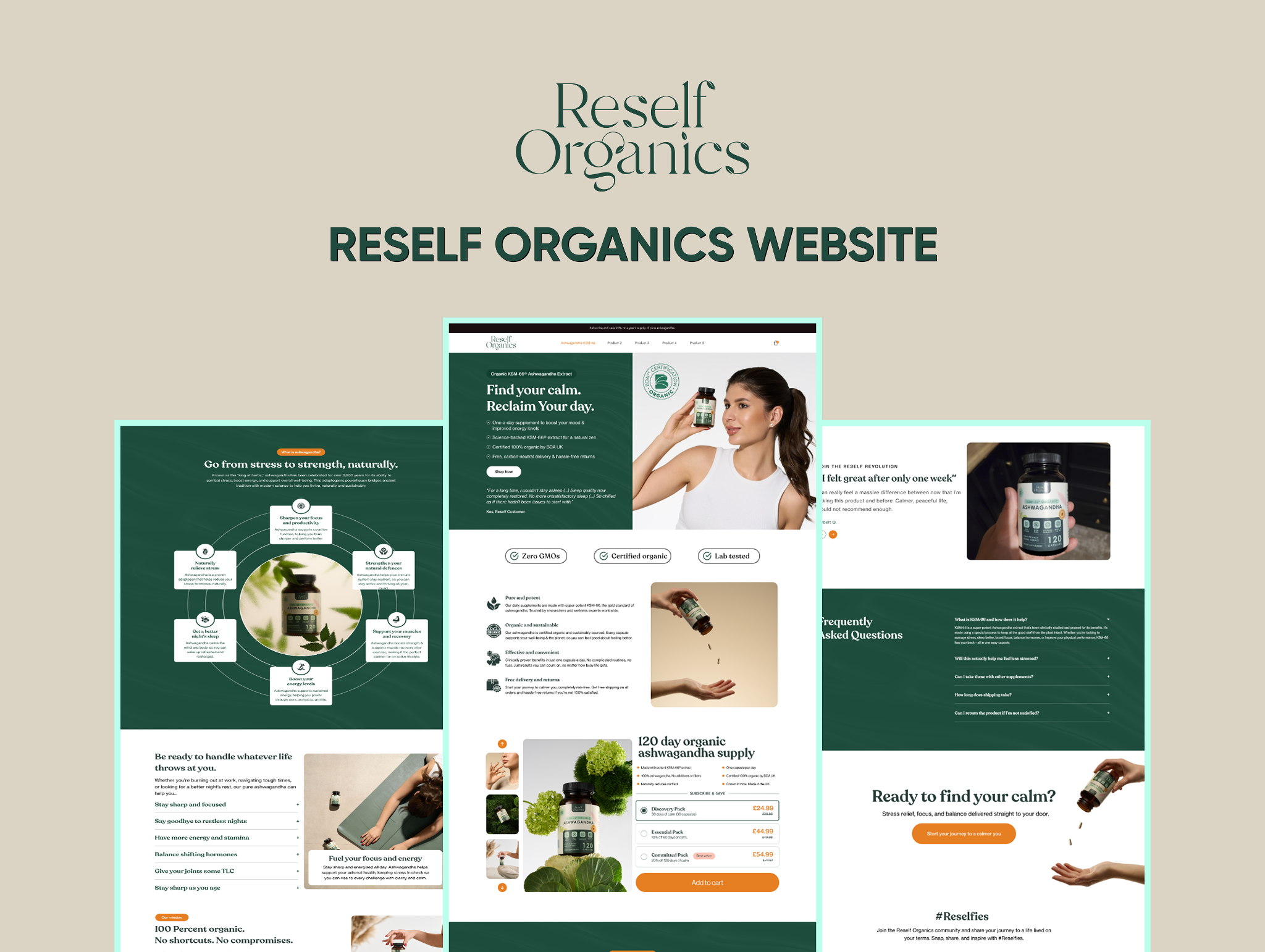
Deep greens, light backgrounds and lifestyle imagery create a grounded visual direction. Benefits, ingredient information and product details are organized into a steady, readable flow.
Deep green panels, warm neutrals and product photography establish a calm visual direction. The opening brings the product, short supporting points and shopping action together.
The purchase area places pack options, pricing and the cart action beside the product image. Orange draws attention to the action within the otherwise restrained palette.
Benefits, customer-story content and FAQs occupy separate sections. The structure gives visitors several ways to explore the product without combining every message into the opening screen.
The presented work is a product-led storefront design connecting the brand introduction, product explanation, purchase options and FAQs.
 Enlarge design ↗
 Enlarge design ↗
Test whether shoppers can distinguish the available packs, understand the purchase terms and find relevant ingredient information.
This walkthrough explains the presented designs. Suggested validation is a next step, not a claim of testing already completed. Post-launch performance data is not included.